As we saw last year, the NBA City Edition uniforms act as a way for Nike and all 30 teams to pay tribute to the state or region represented by the team. The City unis allow teams to get very creative and think outside-of-the-box when it comes to their alternate uniforms.
We've already seen a wide variety of City unis that deviate from traditional looks, and many of them have been received quite well. Others? Not so much. With this year's crop starting to trickle out one-by-one in recent weeks, we're going to highlight (and rank) them all here.
Here are the uniforms that have been officially unveiled, ranked from worst to best.
(Note: The Utah Jazz and San Antonio Spurs are not included in this list because they're using the same City uniform from last season.)
28. Dallas Mavericks
I didn't think it could get much worse than the Mavs' City uniforms last year, and yet here we are.
Proud to have officially launched our Y2 City Edition Jersey! #TrueMaverick
— Dallas Mavericks (@dallasmavs) November 9, 2018
Shop the collection: https://t.co/BdAi10YPj7 pic.twitter.com/0b45ec4bkV
27. Phoenix Suns
For the second straight year, the Suns are paying tribute to their Hispanic community in Arizona with their City look. For the second straight year, they've churned out a very boring and disappointing effort to do so.
Comparison of Suns City Edition alternates. Last season on left, this season on right. pic.twitter.com/ISALtAzJv5
— Paul Lukas (@UniWatch) November 5, 2018
26. Orlando Magic
The Magic basically took last year's City jersey and removed (or scaled back) the best part of it -- the sky pattern. This just feels like a lazy, less appealing reprise.
Magic x @nike x City
— Orlando Magic (@OrlandoMagic) November 1, 2018
On Sale at Orlando Magic Team Shop: Nov. 9 🔥 On Court: Nov. 14 vs. @sixers pic.twitter.com/o64Y6vQfQP
25. Indiana Pacers
I like the racing-inspired idea behind these, but the execution is terrible -- and not just because of my aversion to gray uniforms. This jersey is just ugly as hell. Plus, it looks a worse copycat of the Grizzlies' City jersey (further down on this list). It's a shame because the Pacers' current primaries are some of the nicest in the league. Can't win 'em all, I guess.
Up close: pic.twitter.com/zrAvp4rpIx
— Indiana Pacers (@Pacers) November 8, 2018
24. Charlotte Hornets
The best part of the Hornets' uniforms is their color scheme, so not having purple to pair with the teal here is pretty disappointing. This uniform isn't terrible, but it's rather boring, unspectacular and safe. I feel like the entire purpose of the City uniforms is so that teams can really go for it and get creative, so I'm not a fan of this play.
The 2018-19 #Hornets City Uniforms. @Hornets | #BuzzCity | #Hornets30 pic.twitter.com/jQgFyzkK6P
— Chris Kroeger (@Kroeger) November 1, 2018
23. Philadelphia 76ers
I'm not typically a fan of gray uniforms, and these "Rocky"-inspired ones may end up looking like a sweatsuit out on the court. Overall, the minimalistic design is pretty solid ... I just wish they had gone with literally any other base color.
Our 2018/19 City jersey is here.
— Philadelphia 76ers (@sixers) October 30, 2018
👀 https://t.co/zNcmqDTGP9 | #HereTheyCome pic.twitter.com/zTOM5RLWUy
22. Memphis Grizzlies
The Grizzlies decided to use their City jersey to pay tribute to Memphis' rich wrestling history. The "Main Event" jerseys use a steel gray base (yes, for steel chairs) and feature a pattern down the sides that's supposed to mimic a championship wrestling belt. My favorite part of the look is that the names are located under the numbers on the back of the jersey, but overall these are pretty unspectacular. They might be the best of the Grizzlies' current set, though.
FIRST LOOK: Grizzlies' new City alternate. More info here: https://t.co/4gMVG1sqM6 pic.twitter.com/yhsoyynMqI
— Paul Lukas (@UniWatch) November 7, 2018
FIRST LOOK: Grizzlies' new City alternate. More info here: https://t.co/4gMVG1sqM6 pic.twitter.com/yhsoyynMqI
— Paul Lukas (@UniWatch) November 7, 2018
21. Detroit Pistons
This is the best "Motor City" that the Pistons have had to-date, but that's also not really saying much. The racing stripes down the middle is a pretty neat touch, but I hate that they went black and silver here. Detroit's red, white and blue color scheme is great, so I wish they had incorporated it here ... or at least thrown it back to those weird teal jerseys from the 90s.
Our city. #MotorCity
— Detroit Pistons (@DetroitPistons) November 1, 2018
Our new black City Edition jerseys are based on inspiration from automotive culture and the hard-nosed mentality of Detroit.
On-court debut November 23! #DetroitBasketball pic.twitter.com/1xRuSpEddS
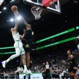
20. Boston Celtics
It feels like the Celtics went with a really safe play here. The gold trim looks great, but the solid green neck and arm stripe makes the jersey look a little bland. It feels like they would have been better off trying to work in their usual striping. Overall, these aren't terrible, but they're not great either.
Tradition redefined. Say hello to our 2018-19 City Edition. ☘️
— Boston Celtics (@celtics) November 9, 2018
Shop the collection: https://t.co/TY7XEN35Fu #CUsRise pic.twitter.com/cglbWg5OWR
19. Atlanta Hawks
The bird feathering design down the side of these unis is a pretty unique and cool feature, but the rest of the jersey isn't all that exciting. The gold trim is used as a celebration of the Hawks' 50th anniversary season, and it's certainly better than the neon trim that they usually trot out.
For the fans. For the culture. For the 🅰
— Atlanta Hawks (@ATLHawks) November 6, 2018
👀| https://t.co/NAewD6CWbG#TrueToAtlanta pic.twitter.com/EF3azyA11q
18. Los Angeles Lakers
After using last year's City jersey to honor Kobe Bryant, the Lakers have chosen to use this year's to honor another team legend in Magic Johnson. The idea is a good one, but the uniform, which was apparently designed by Magic himself, doesn't quite land that classification. I like the incorporation of pinstripes to honor Magic's business side, but the front looks a little too busy with the full "Los Angeles" included in the Lakers' wordmark. That being said, they might be better than the Lakers' other purple jerseys this year.
Showcasing elements of @MagicJohnson’s life on-and-off court, from the scoop neck to the pinstripes 👔 pic.twitter.com/i9adbtc2zJ
— Los Angeles Lakers (@Lakers) November 9, 2018
17. Washington Wizards
"The District of Columbia" on the front is a pretty badass alternative to the Wizards' typical wordmark on the front of their jerseys, and the Washington Monument running up the side of the uniform is pretty neat. But I hate that they completely abandoned their red, white and blue color scheme to go with a boring black alternate. You could have had the regular color scheme work as an accent somewhere. Instead, we have a uniform that falls disappointingly short of its potential.
🐼 x 🔥⬛️#RepTheDistrict #DCFamily pic.twitter.com/lfZyLNEr97
— Washington Wizards (@WashWizards) November 2, 2018
16. Golden State Warriors
The Warriors are honoring the Bay Area's Chinese community with these uniforms. They did a good job incorporating a lot of elements from Warriors uniforms past and present while also mixing in elements of Chinese culture. Overall, it's a nice-looking uniform.
Warriors' new City alternates. pic.twitter.com/3nVJZmwTyN
— Paul Lukas (@UniWatch) November 9, 2018
15. Portland Trail Blazers
The Blazers have gone with a "RipCity" alternate as their City jersey for the second year in a row, but this year's version is a significant upgrade from the last. It features Portland's typical black and red but mixes in some gray and has a sleek, minimalistic take on the Blazers' jersey sash. It's not a bold or daring alternate, but it's a sleek and solid look.
(Rip) City Edition pic.twitter.com/N9TgiKFejq
— Trail Blazers (@trailblazers) November 8, 2018
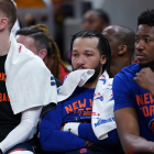
14. New York Knicks
Between the dark jersey and the non-arched wordmark, this doesn't really feel like a Knicks jersey -- even if it is a loose throwback to what the team wore in the 1950s. However, there's no denying that the skyline striping going down the side of the uniform is incredible. It's an old school look that brings a touch of cutting-edge cool. I dig it.
Our City Edition uniform represents your stories, languages, neighborhoods and ambitions. Available at the MSG Team Store. #WearNewYork pic.twitter.com/1yeyXaRuo0
— NEW YORK KNICKS (@nyknicks) November 9, 2018
13. Chicago Bulls
The Bulls approached their City look with a minimalistic approach and came away with a pretty surprising winner. Chicago's flag is awesome, so it's very cool to see them use it as the City jersey's inspiration for the second straight year. This rendition is infinitely better than last year's.
— Lauri Markkanen (@MarkkanenLauri) November 1, 2018
12. Milwaukee Bucks
The Bucks have embraced the Mecca era a few times recently, most notably with the throwback court design. I love that it served as the inspiration for this year's City unis, and they did a pretty good job creating a bold and unique alternate that pulls from their history while also bringing a slightly modern touch.
The 2018-19 City Edition In Photos!!
— Milwaukee Bucks (@Bucks) November 5, 2018
📸| https://t.co/7wxxVFZDhS pic.twitter.com/7O6W1JwU5M
11. Toronto Raptors
This year's Raptors' City jersey is basically the same OVO collaboration as we saw last year, but with a white uniform instead of black. The black is a tad bit superior, but this is still a pretty sleek and attractive jersey. Drake's influence still reigns supreme in Toronto.
The Toronto Raptors have unveiled their 4th uniform also known as their "City Edition" Nike jerseys.
— Kris Pangilinan (@KrisReports) November 9, 2018
This jersey is similar in design of last year's, but in white. It's called the OVO City Jersey. #WeTheNorth pic.twitter.com/qksWIIFlLe
10. Sacramento Kings
The Kings will use a retro design that's nearly identical to their City look last year, but the big change comes across the chest. Instead of using the team's alternate logo, they'll sport "Sactown" across the front of the jersey. It's an upgrade.
Comparison of Kings' City alternates. Last season's version on left, this season's newly leaked version on right. pic.twitter.com/6t6Umsq53Z
— Paul Lukas (@UniWatch) November 7, 2018
9. New Orleans Pelicans
Going with the Mardi Gras theme for the City jerseys was a no-brainer, and the execution is very solid here. The jersey is vibrant, colorful and fun, which is exactly what you want in a Mardi Gras uniform. One has to assume the hangover and regrets are sold separately.
#Pelicans City Edition Mardi Gras jerseys/gear now available at our team shop! -> https://t.co/pOI0li8VGS#doitBIG pic.twitter.com/i5Fv1RvcgZ
— New Orleans Pelicans (@PelicansNBA) November 9, 2018
8. Houston Rockets
Like the Warriors, the Rockets are embracing their Chinese market with their City uniform. Houston did this last year as well, but the new version is a massive upgrade. Like, MASSIVE. The level of detail in this jersey is outstanding and end result is fancy as heck. The color scheme makes looks a bit more like a Cavs uniform than a Rockets uni, but it's a beauty regardless.
Our Lunar New Year jersey is available NOW on https://t.co/5PuiMVTnj4! 🚀 pic.twitter.com/Sh0dJ2X04C
— Houston Rockets (@HoustonRockets) November 9, 2018
#Rockets “Auspicious Clouds” City Edition jerseys. pic.twitter.com/sHaghoDCBm
— Kelly Iko (@KellyIkoNBA) November 8, 2018
7. Cleveland Cavaliers
The Cavs went with a bold City uni that deviates pretty far from their current look. The look draws from several aspects of the city and the franchise's history, which I like a lot. The orange and blue reflects the team's color scheme from the 1980s-90s, while the wave pattern is a nod to Lake Erie and the jersey design that the team used in 1994 when they returned to downtown Cleveland. The city's script wordmark is a nice touch as well. Overall, this is a very different and very cool uni for the Cavs.
New Threads😱#ThisisCLE pic.twitter.com/AJ0DsjlcZm
— Wine & Gold United (@CavsWGUnited) November 8, 2018
6. Los Angeles Clippers
The Clippers' City look brings a nod to the 1984 Olympics, which were held in Los Angeles and happened to coincide with the year of the Clippers' inaugural season. The prominent "LA" wordmark across the front of the jersey is a strong tribute to the '84 Olympic logo, and the five stars running down the side are reminiscent of the uniforms that Team USA wore during those Games. The Clips' usual number style doesn't seem to fit great with the vibe of the jersey, but otherwise it's an awesome uniform.
Debuting Saturday vs. Milwaukee
— LA Clippers (@LAClippers) November 9, 2018
🎟 | https://t.co/IhocLq21nA pic.twitter.com/jPFzU7wZTL
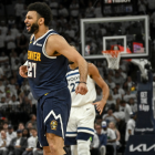
5. Denver Nuggets
The Nuggets' skyline jerseys are their always their best, so it's a shame that they don't wear them full-time. I'm very excited to see the rainbow design come back with these City jerseys, which seem like a modern interpretation of the classic rainbows. I'm not overly crazy about the navy blue collar and no arm stripes, but overall I like these a lot.
🌈 X 🏙️ #THERETURNOFTHERAINBOW pic.twitter.com/V5TMXtAl9K
— Denver Nuggets (@nuggets) November 1, 2018
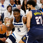
4. Minnesota Timberwolves
Like most people, I was extremely excited to find out that the Wolves were going to unveil a "Purple Rain"-inspired jersey to honor late hometown hero Prince. These jerseys are very good and will likely be very popular both in Minnesota and league-wide, but it feels like they fall just short of being great and that's frustrating.
Purple Rain inspired Minnesota Timberwolves uniforms 😈😈 as a nod to Prince pic.twitter.com/TAuZvBaJdR
— Modern Notoriety (@ModernNotoriety) November 1, 2018
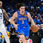
3. Oklahoma City Thunder
The Thunder have the worst uniform set in the league and, frankly, it's rather staggering that their primary look has survived for so long. That being said, this is the best jersey that the team has ever had. Not only is it gorgeous and vibrant, it's also the first turquoise NBA uniform to pay tribute to Native American culture. That rules.
Thunder Unveils New Turquoise Uniform Honoring Oklahoma's Native American Heritage
— OKC THUNDER (@okcthunder) November 1, 2018
🔗 https://t.co/savSXku6JW pic.twitter.com/70Ob94B7rH
2. Brooklyn Nets
Pop culture tributes have clearly been a popular theme for the City unis this year, but the Nets have the best of the bunch. Honoring the late, great Notorious B.I.G. with the Coogi sweater pattern in the trim is such a subtle but incredible move that turns their typical, somewhat-bland primary uniforms into a work of art.
⚡️ Biggie x Nets https://t.co/frzF7v9eYT
— Brooklyn Nets (@BrooklynNets) November 1, 2018
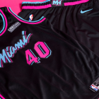
1. Miami Heat
The Heat had the biggest winner of last year's City crop and they were smart enough not to mess with success this year. They basically took the same concept as last year and put it on a black jersey instead of a white one, and the result is yet another winner. In fact, the black version might be even better considering it makes the neon Vice colors pop more. Now the only thing left for the Heat to do is make the set their full-time primaries.
FIRST LOOK: @MiamiHEAT follow up last year’s “Vice” jersey success with a black version for its City Edition Jerseys. Team will play in this 🔥for 14 games. First game is Friday. pic.twitter.com/2JFQhEy0Dk
— Darren Rovell (@darrenrovell) November 5, 2018