Throughout the season the CBS Sports MLB experts will bring you a weekly Batting Around roundtable breaking down pretty much anything. The latest news, a historical question, thoughts about the future of baseball, all sorts of stuff. Last week we debated the worst team in baseball. This week we're going to pick between City Connect uniforms.
What are your favorite City Connect uniforms?
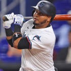
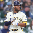
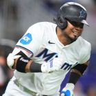
R.J. Anderson: I suspect the Rockies and Marlins will be popular picks. For the sake of variety, I'm going with the Rangers. I didn't love them when they were first revealed. Seeing them in action, though, has changed my mind -- to the extent that I think they're my favorite of Texas' looks. Every aspect of the uniform works, in my opinion: from the logo (long live the Peagle) to the colors and so on. I'm seldom a fan of non-white/gray baseball pants; the Rangers' City Connects are an exception.
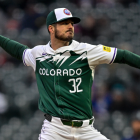
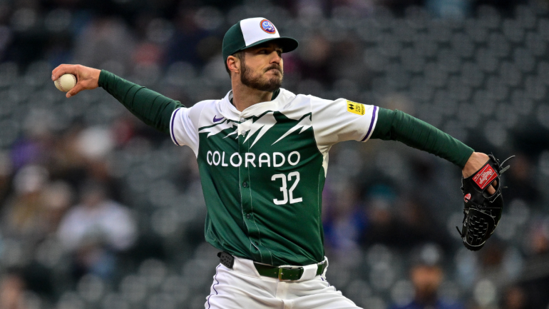
Dayn Perry: Marlins, Padres, and Rockies are my favorites, but above all I have to go with the Rockies. It's a bold look that's a serious departure from their standard unis. I love the green that evokes the Colorado license plate. The hats look great, and even the white belt stands out in a good way. Overall, it's a palette we don't often see in MLB, and it makes for a really strong and unique look that evokes Colorado very well.
Matt Snyder: This is the furthest baseball-adjacent thing from my wheelhouse that I can think of. It's weird. I rank everything. Yes, I do our power rankings here, but for myself I rank things like movies, TV shows, roller coasters, songs, etc. And yet, on uniforms, I just can't muster strong opinions. There are certainly some I like more than others, I think, but nothing really moves the needle much for me on this front. I usually don't seem to love the ones people love (Nationals cherry blossoms) and don't seem to hate others as much as others. I'll just say the Cubs' Wrigleyville ones since I'm a Cubs fan. Whatever.
Mike Axisa: The Angels. They are a top-tier look. The sand color represents the Orange County beaches, the little fish tail at the end of the S is a nod to franchise legends Mike Trout and Tim Salmon, and there's a halo over the A for obvious reasons. The Angels' City Connects are so, so sharp. The Rockies are excellent, as R.J. and Dayn noted, and I dig the Orioles too. I didn't like them when I first saw the reveal, but they look much better on the field.