The Arizona Cardinals became the latest NFL team to update their uniforms this week, revealing a new apparel combo that emphasizes simplicity -- and more silver -- on their jerseys. Aesthetic tweaks are increasingly common across the league; just last year, 14 different teams unveiled new helmet-and-jersey combos.
So which teams are best suited for the next big makeover? Here are five clubs that could benefit from a fresh look:
5. Denver Broncos
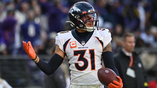
The Broncos' current color scheme -- navy blue and orange -- will always have a place in history, as both John Elway and Peyton Manning wore the modern look for Super Bowl victories in 1997, 1998 and 2015, respectively. But there's a reason the team's new ownership has already polled season-ticket-holders about favorite looks from the past. The current orange now registers as flat in contrast to the brighter shade they rocked from the 1960s-90s. Why not resurrect the brighter royal blue as well?
4. Houston Texans
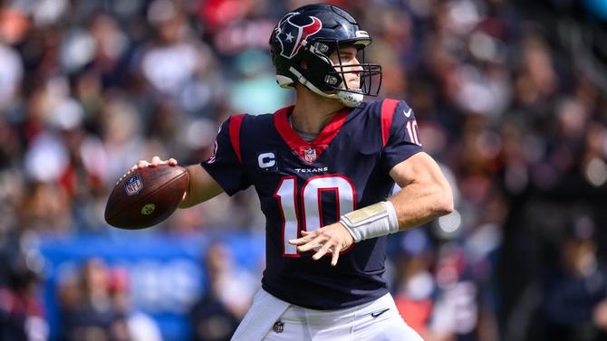
Their colors and designs are far from appalling, but they've also been wearing the same threads since their entry as an expansion team in 2002. They're the definition of a serviceable but unspectacular-looking team. What better time to give the getup a bit more flair than now, with a bright new coach in place and a new face of the franchise potentially arriving at the top of the draft?
3. Tennessee Titans
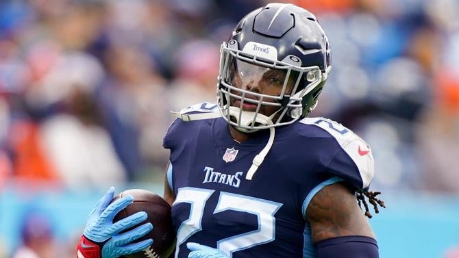
Like their AFC South rival Texans, the Titans aren't an eyesore in their current colors. In fact, their signature light blue has lots of potential. But ever since their relocation from Houston in the franchise's transition as the Oilers, they've muted their own pop by emphasizing darker blue and grey. The effect has been a much duller look than, say, the baby blue adorned by icons like Warren Moon in the 1980s-90s.
2. Atlanta Falcons
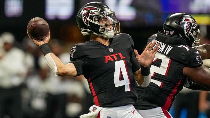
The Falcons followed their division rival Buccaneers in revealing new uniforms in 2020, but unlike Tampa Bay, which wisely reverted to a more beloved retro design, Atlanta went all in on Nike's modern template. The result: a glaring "ATL" on the front of the jerseys, which is creative in theory but only serves to emphasize how basic yet confounding their wardrobe has become: from gradient alternates to blocky, shadowed numbers, they can be distracting more than appealing.
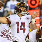
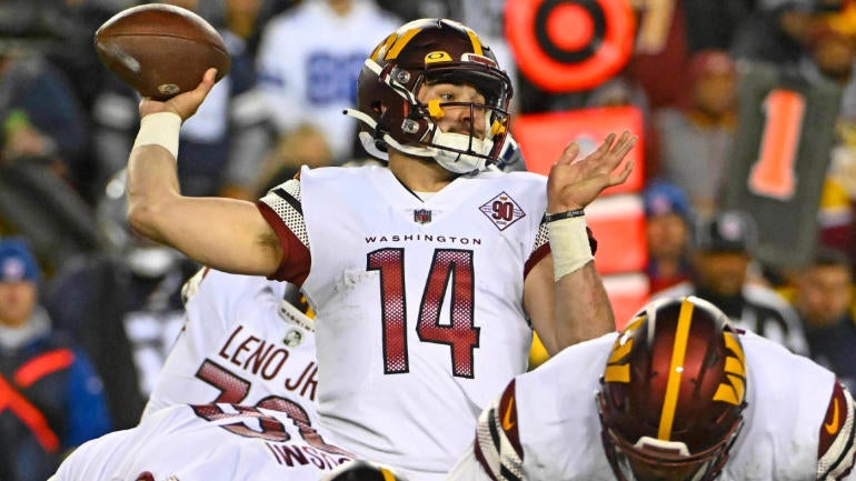
1. Washington Commanders
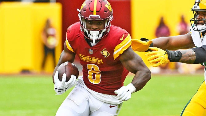
Notice a trend here? Like the Falcons, the Commanders are just getting used to their updated uniforms, revealing their current look in 2022 while transitioning from the Washington Football Team label. And like the Falcons, their issue isn't the colors -- burgundy and gold have been well-regarded staples of the franchise -- but the presentation of them. Substituting the Falcons' oversized "ATL" chest label for a wordier "Commanders" ID on the home jerseys, their away uniforms also ditch shoulder numbers for a busy color pattern, making for an outfit lineup that looks precisely like one you'd find on a last-minute expansion team.